Mcliff
A vending company that provides employee workplace refreshments, selling to 5 distinct locations across Texas. Connecting as a fractional marketing team, we created and implemented a unified communication strategy for Mcliff’s distributed sales team.
Branding, Web Design, Layout Design, Environmental Design, Social Media Design, Image Composition, Infographic Design
Challenge: Seizing a vending opportunity amidst workplace changes, the marketing and design team expanded the content and visual branding surrounding the service lines, enhancing sales team communication.

A playful Refresh
In a strategic move to tap into marketing company culture, we repositioned Mcliff as an “Employee Experience Company” and gave the brand a playful refresh.
Project Gallery
☆
Project Gallery ☆
Brand Guide
Click on images to expand ⇱
The brand initially was direct and corporate, not conveying the fun nature of the break-time experience.
We created standards for visual design and built a system with growth in brand colors and graphics.
Website
The content team re-wrote Mcliff’s website with new messaging and clear Calls to Action and the design team redesigned the flow and visual styles of the website with value-first content and new branding elements.
Email & blog
Generating a targeted email campaign, rebranded templates were designed for newsletters and in-house communications with Mcliff employees.
Service centered blogs were written to strengthen and provide social proof. Uniquely branded image compositions were created to accompany the blogs and newsletters.
Signage
Brand awareness was increased through coffee service and vending machine signage at the physical locations that Mcliff services. Truck wraps branded in the new styles were designed and applied to Mcliff’s delivery vehicles, further increasing brand recognition.
Design Approach
-

Texture & Imagery
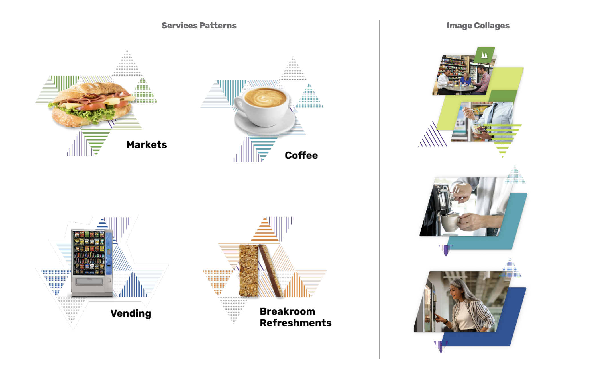
We created a texture mimicking the logo’s triangles with variations for use in service line assignment. We also began using whimsical snack images, isolated and sometimes in a collage setting.
-

Color Expansion
Creating distinction between services led to a color expansion from a 3-color palette to a 6-color palette with shades for variation.
-

Layout Styles
In layout styles, we found a diagonal shape useful to frame images or flow content in an energetic way.
Outcome & Reflection
A concerted effort of content creation brought consistent messaging centered around Mcliff’s offerings, standardized and grew the visual branding, and led marketing campaigns that succeeded in increasing year-over year revenue, improved visibility in local searches, and brought in new potential customers.
Shifting tone with strategic visual tools towards a sales-enablement position allowed for a connection with a new base target audience and added value and depth to Mcliff as a company.


